http://www.itsnicethat.com/articles/citymapper-gilbert-wedam-1
Gilbert reckons his passion for maps stems from his childhood. “My primary school was international – we were 90 kids, but from 80 different countries,” he says. “That heavily influenced how I grew to ‘see’ the world. The world was always connected, and what was beyond the horizon always felt close. Since my late teens, I’ve always lived in big cities. I like the mess, the endless crossroads – socially and geographically.Citymapper's logo is really simple and conveys the idea of easy travel very clearly.
Uber Launches a new city-centric visual identity
http://www.itsnicethat.com/news/uber-rebrand-030216
| Mexico |
Transportation and logistics company Uber has rebranded with a new logo and visual identity. Replacing the familiar black, grey and white interface each of the 65 launch countries will work with a palette of colours, illustrations and guidelines that are unique to each location. “Our new look and feel celebrates both our technology and the cities we serve,” says CEO Travis Kalanick. “This updated design reflects where we’ve been, and where we’re headed.”
The existing logotype has been condensed and simplified, with the curls from the U and R removed – something Kalanick likened to a “1990s hairstyle.” The user interface now revolves around the “bit” and the “atom” seen in the new app logo – the square representing the bit, and the new circle icon being the atom. Somewhat philosophically, Kalanick says: “The unique aspect of Uber is that we exist in the physical world. We exist in the place where bits and atoms come together. That is Uber. We are not just technology but technology that moves cities and their citizens."
The atoms, which define the architecture of the rebrand, are to be tailored to each specific location that Uber operates in. Bespoke colours and patterns have been curated for each city around the world has been inspired by “architecture, textiles, scenery, art, fashion, people and more.”Uber's rebrand is very catered to the customer and feeling personal to them, using different colour schemes across countries. The logo has more concept this time around - being about connecting people and cities.
The logo however is possibly not as memorable now, but time will tell.
Budapest Public Transport Logos
https://www.behance.net/gallery/20040227/Budapest-Public-Transport-Logos
Concept
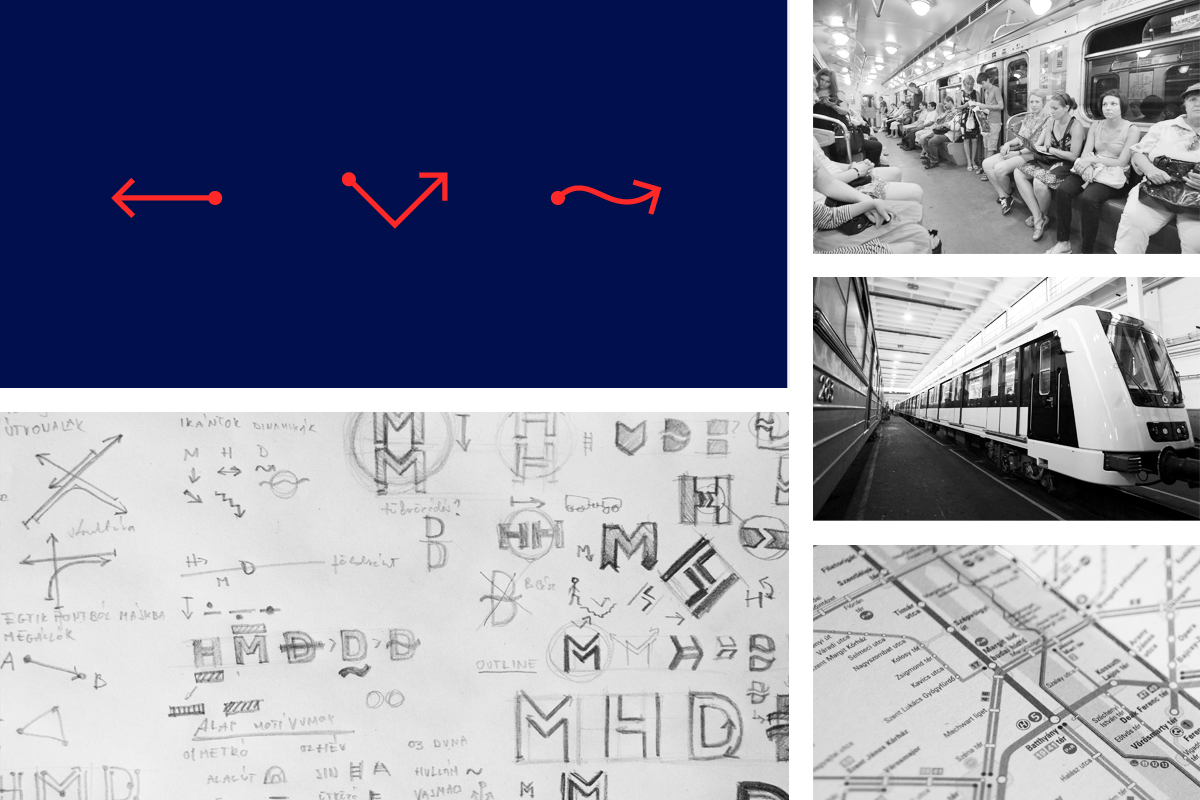
As the former logos did not correspond each other, a solution was needed to unify the marks in the whole communication system, thus helping the travelling public to easily find their way.
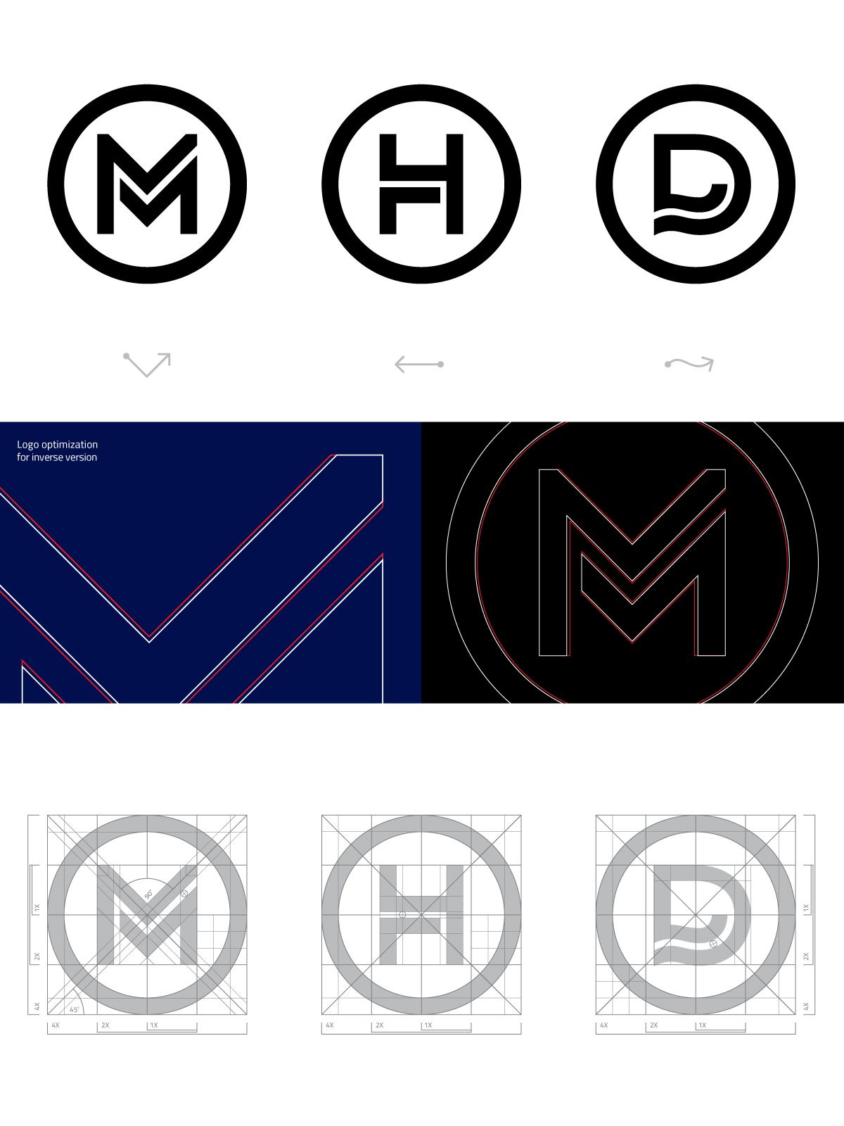
Our concept slightly evokes the patterns of ‘tracks’ and ‘transportation lines’ by simply doubling the lines in each logos at certain parts of the letters, this way referring to the directions and dynamism, just like how lines go next to each other on a map.
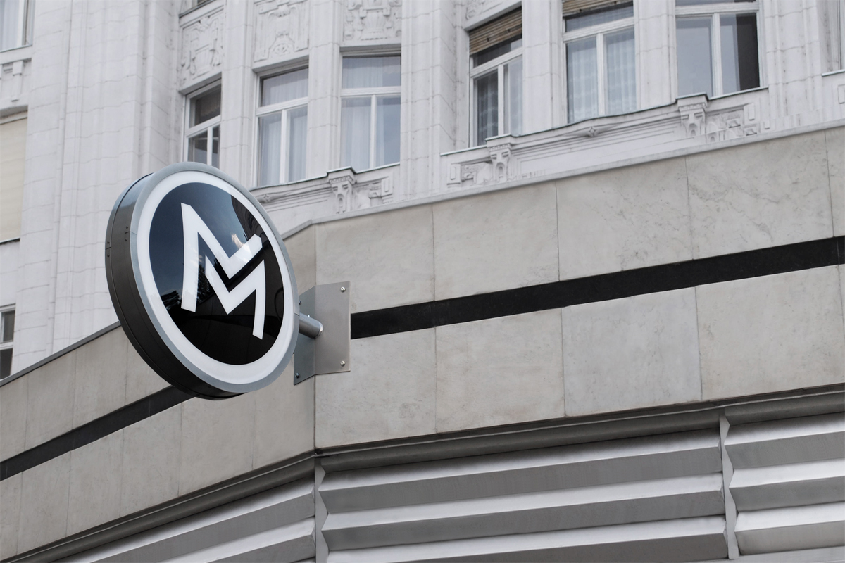
These logos created for Budapest transport are very simple and effective - the clear concept of movement and tracks is conveyed.
However, unique and creative? Not so much, but very functional.
Hyperloop
https://www.behance.net/gallery/33351723/Hyperloop
We created a typeface that inspired by smooth, effortless motion which flows from character to character in a gentle wave formation. The eye is led gently from the beginning of the typeface to the emblem of the logo. The wave throughout is inspired by a number of elements. Hyperloop claims to travel at the speed of sound therefore the logo takes reference to the wave formation of sound. We also wanted to capture the speed and comfortable transportation that Hyperloop provides through incorporating a gliding bird into the emblem. The gradient represents the extreme acceleration that Hyperloop exceeds when in transit between its destinations.
Research. Through investigation into the priorities of the target market of the travel system, it was found that the majority of users would be tourists. San Francisco and Los Angeles are widely known for their tourist attractions such as Disneyland, The Golden Bridge and Rodeo Drive. Current time to commute between the two locations is approximately 13 hours via train and 6 by coach. The Hyperloop system will reduce this time to just 30 minutes. We found this to be most beneficial to tourists who wish to hop between locations quickly, for example; day trips. This service then subsequently allows for tourist attractions to partner with the Hyperloop brand, offering deals and discounts for its customers. We found it to be a very expandable area of the market.
The Band. Research found that current methods of transport require numerous travel documents, which can frustrate the customer and be time consuming looking for specific documentation. With Hyperloop, we designed a wearable wristband that allows users to keep important information such as tickets in one safe place. The system eradicates the need for an interrupted process of showing identification and other documentation. It allows users to swiftly pass through barriers providing they have a valid ticket, which in turn represents the smooth and effortless experience that the customers will undergo on their Hyperloop journey.We looked at a groups branding of Hyperloop we came across that uses the concept of sound.


No comments:
Post a Comment