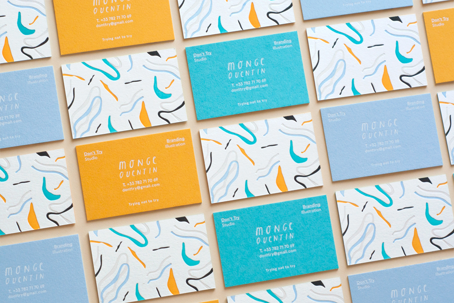
https://www.behance.net/gallery/30977789/Dont-Try-Studio-Business-Cards
Set of colorful business cards. White foil / 5 color letterpress on triplex colorplan paper.These business cards are very simple and showcasing the playful style of the studio. Using handwritten type for the names adds a personal, down to earth touch.
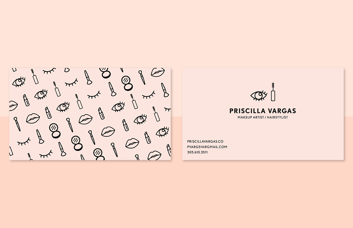
https://www.behance.net/gallery/27990161/Priscilla-Vargas-Makeup-Artist-Branding
Priscilla Vargas is a NYC based makeup artist and hairstylist. She's done everything up to NYFW, working for clients like HBA and Coach. Her artistry varies from trendy, edgy, soft, and extreme. Her branding is a mix of sophisticated, youthful, and trendy with a color palette inspired by skintone and blush.
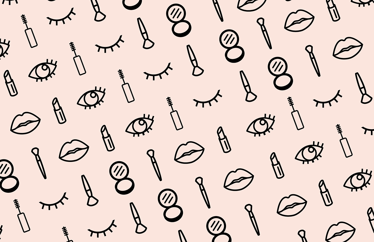
This identity is very sharp and clean; the neat vectors portray what they need to very clearly. The typeface used communicates fashion and trends, which are appropriate.
I will say that perhaps the designs lack some personality and seem a little cold.
I will say that perhaps the designs lack some personality and seem a little cold.
http://www.itsnicethat.com/articles/underline-studio-daniel-ehrenworth-070116
Daniel’s style is typically bright and punchy and he’s been been commissioned by a range of clients including Google, Hyundai and Bloomberg Businessweek. “[Daniel] came to us wanting a bold identity reminiscent of 1970s film titles and The Muppet Show,” explains the Toronto-based studio. “We reworked these influences to create a contemporary identity and colour palette that parallel Dan’s style of photography and playful, exuberant personality.”This branding certainly is fun! The typeface is refreshingly unique and the colours are bold and daring. The postcards with puns on them perfectly reflect personality and lightheartedness.
From tropical yellows to vibrant magentas, Underline places Daniel’s name at the heart of the identity and has sprinkled various nonsense phrases that contain Dan in them through the printed materials, giving the identity even more character. With a high gloss finish and spot matte varnish on the accompanying collateral, the branding is fresh, inviting and fun.
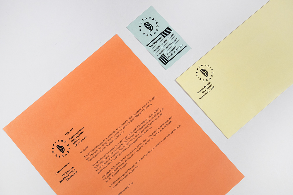
https://www.behance.net/gallery/22050105/Daptone-Records-Rebrand
Concept/Background:
Daptone Records is an independent soul- funk- and gospel label, founded in 2001 by Gabriel Roth and Neil Sugarman. Since the start, they and their big analogue studio have been located in Bushwick, Brooklyn.
The label is completely owned and run by musicians which makes them pretty unique. Especially since the owners themselves often plays a few of the instruments of the albums that they are releasing. Even though they are a small label and by their own admission have rejected the music industry, they have released some important and future classic albums.
I wanted to design a new visual identity that catches the analogue and vintage feel that all of Daptone’s albums have, and still keep the authentic feeling. I aimed for a relevant profile that works with their soul aesthetics and shows that their bands are all under one roof – Daptone’s.
Result:
The new logotype is a D made of a stylized bended vinyl, which is a metaphor for Daptone Records. To bend a vinyl record without breaking it is kind of impossible, or at least very hard. To be an independent soul label, with an analogue studio fighting the major labels and the music industry itself, also is pretty hard. The round shape is kept from the old logotype and it works in both black on light surfaces or in white on darker ones. As well as a bended vinyl, the icon can also be read as audio waves or as an ear. The color scheme is inspired by vintage concert tickets and the desaturated colors keeps the feeling of Brooklyn.
The new op-art pattern is based on the logotype. But it’s inspired by the tracks of a vinyl record, the safety pattern usually seen on concert tickets and by the groovy pattern sometimes seen on soul- or funk posters.Even though this isn't someone's personal branding, I was very attracted by the colours and classic style.
Next I have looked at some interesting profiles on Behance and studied their choice of icon and how it reflects their work. This is the useful thing about Behance, the name and icon on someones profile is the quickest way to sum up their style.
Common features used:
- illustrative self portrait
- initials
- full name
- random piece of work







No comments:
Post a Comment