London Transport Museum shows 150 beautiful and innovative Tube posters
http://www.itsnicethat.com/articles/150-london-underground-posters
These vintage posters are very attractive- they were clearly trying to persuade people to use the new underground train system. The use of capital, bold letters is evident and simple imagery that makes the tube seem futuristic and exciting.
Transport For London
https://www.behance.net/gallery/33666220/Transport-For-London
We were asked to illustrate a public information poster for Transport for London to promote the WiFi connections in London underground stations. The illustration takes the form of the international WiFi symbol with the signal bars portraying London’s different types of public transport, its iconic buildings and elements of its life.This poster is very modern and clearly depicts different areas and transport of London while making the shape of the wifi symbol - very clever.
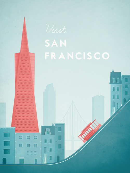
I've looked at a lot of travel posters that use primarily illustration, as that is what we want to do as part of our brand. They seem to all use a simplified colour scheme to give it a specific atmosphere. As for landmarks, Los Angeles imagery is the highrise buildings and the palm trees, or focusing on stardom. With San Francisco, its all about the bridge and the hills.
Typography is a strong factor in these posters - the letters usually being sophisticated and uppercase.
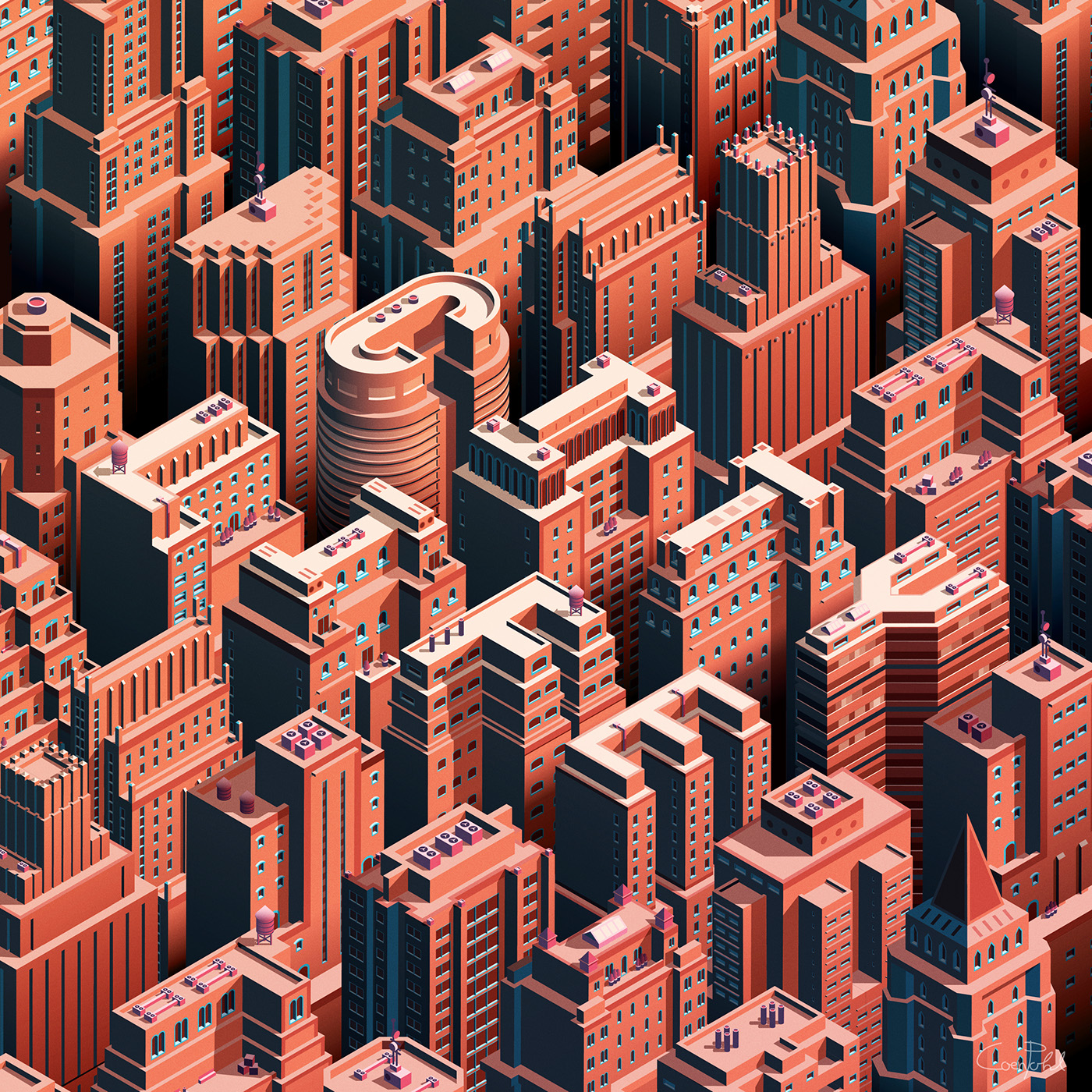
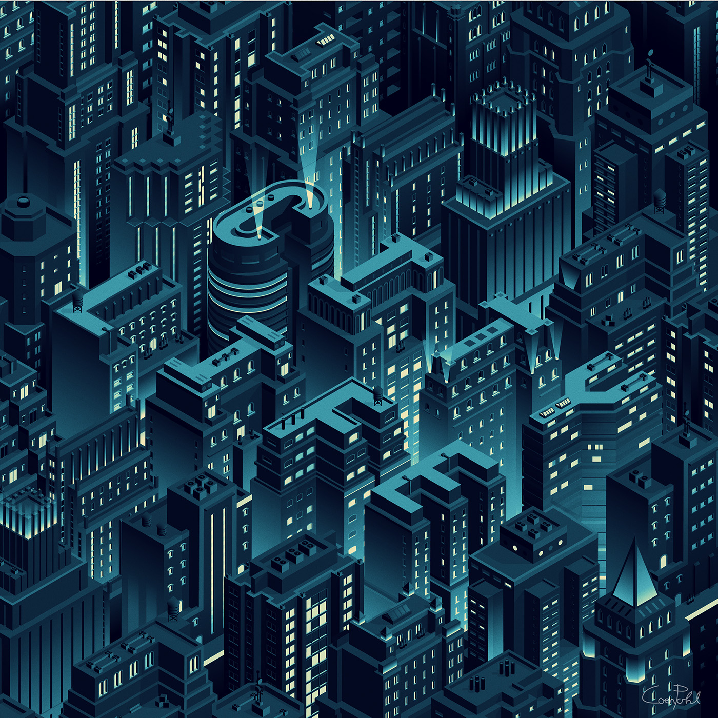
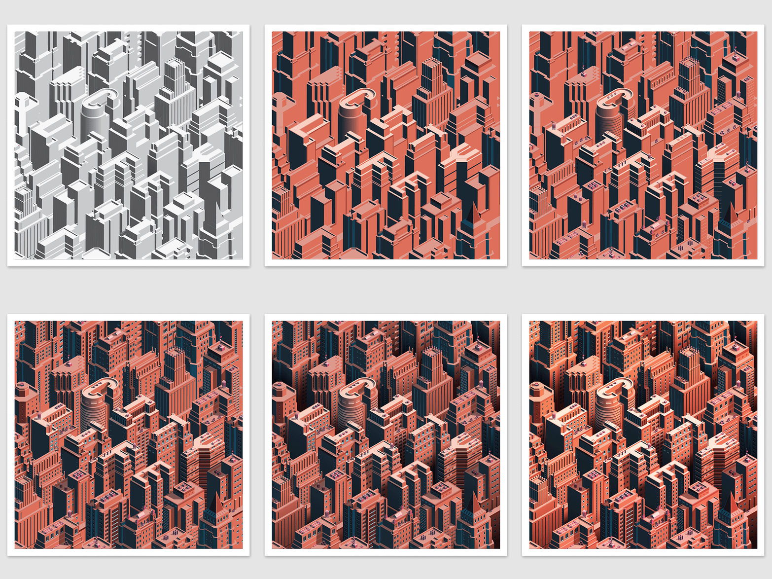
Towers of San Francisco
https://www.behance.net/gallery/31476875/Towers-of-San-Francisco
Airbnb San Francisco poster
https://www.behance.net/gallery/32554715/San-Francisco-poster-for-airbnb
These vector illustrations are similar to what we have in mind: something very stripped down and iconic looking. This is especially helpful as these buildings are based in San Francisco. The group agreed that these were effective.
By the same illustrator:
Airbnb San Francisco poster
https://www.behance.net/gallery/32554715/San-Francisco-poster-for-airbnb
A few weeks ago i was contacted by the team at Airbnb that wondered if I was interested in making a poster for them as part of a project made to inspire the way we think about travel destinations.
With the poster they wanted to celebrate the quirky, human, intimate, vast and dreamlike qualities that a place can have.
The city they wanted me to illustrate was San Francisco and it was fun to interpret a place i yet haven´t been to but somehow still have a relation to thru music, movies and so on. I wanted the typo to feel kind of vintage 70s but with with the details in the drawing that gave it a contemporary whole.
Illustrations by Malika Favre
http://malikafavre.com/
https://www.behance.net/gallery/25869191/Port-of-San-Francisco


No comments:
Post a Comment